I’d rather be lucky than good, part II
Friday, 11 June 2010
By the time you read this, the WSOP 2010 will have started. Thousands of players will have flown in to Las Vegas from all continents in an attempt to immortalise themselves in the poker world. Around 50 of them will leave with a 2010 WSOP bracelet on their wrists. How many arrive thinking they will leave with one?
A couple of years ago, I wrote an article titled “I’d rather be lucky than good”. In a world desperately devoid of decent, easily available information on what sort of profits good tournament players could make, and just how unlucky money making players can get, it was an attempt to start answering questions with cold, hard, numbers.
Two years later, the situation is a lot better as far as information is concerned. The term ROI (return on investment – a measure of how profitable a tournament player is per tournament in terms of percentage of the buy-in) is bandied about on forums and in books, and most (good) players have some idea of how cruel fate can be, and just how big downswings can get on the tournament circuit.
ROI is all very well, but it’s predicated on the “long run” – a rather cruel master which, as the original article established, might well involve more years (well, actually, lifetimes) than any mortal has to throw at the poker gods in pursuit of glory.
Since writing that article, I had always wanted a question answered: how can you expect to run over a relatively short period? What are the limits of good and bad luck, and what does the bit in between really look like? How to simulate that wasn’t obvious. However, after having thought a lot about it, and having created one hell of a monster excel spreadsheet, I want to give it a go.
Since it’s the WSOP, I thought it appropriate to model the answer in terms of a trip, or actually a number of trips to Las Vegas, with a given bankroll, attempting to enter a given number of tournaments. The spreadsheet created by myself and the author of No Limit Texas Hold Em for Winners, Dan Shavick, will simulate multiple trips to Vegas, graphing the results.
The model itself is based on the prize pool of Event #13 of the 2009 WSOP – a $2,500 buy in NLHE event which had 1,088 runners and paid 116 places, according to the standard prize distribution of the WSOP. I tried to use a tournament which was a typical WSOP event. The field is large but not huge (note that for many of the tournaments the average player enters, the results you see below should be more extreme), and in being a medium-large field NLHE event, it figures to be the kind of event that a good player should have a decent ROI in.
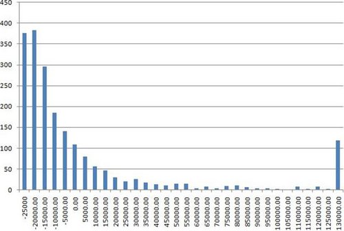
Let’s start off with a player who has an ROI of 50%, going to Vegas to play a total of ten WSOP events. For live events, an ROI of 50% isn’t setting the world on fire, but our player still figures to be good (likely a professional), and perhaps chancing his arm at the World Series over a number of events. His expectation graph looks like this:

First, I should reiterate exactly what this graph is about. This is a frequency chart of 2,000 simulated trips to the World Series, where a player enters ten WSOP events with about 1,000 runners and a $2,500 buy in (and said player has a 50% ROI in these events). Each unit on the graph thus represents one year (and thus the outcome of playing ten events). The x-axis is a series of intervals representing how that player fared in each year. The worst that player could possibly do is bust out in all ten events, and have an overall loss of $25,000. Such a year would appear in the -$25,000 to -$20,000 interval, which is the leftmost bar on the graph. So, for example, the bar above the zero represents the number of years that player came back from Vegas having made between 0 and $5,000. The y-axis represents the number of years which fall in each interval. So you can see that of the 2,000 trips to Vegas simulated, 185 of them end up with the player coming back between $10,000 and $5,000 down.
Not great is it? Despite having a respectable ROI, our player figures to come back from Vegas in the red 70% of the time. Most of the time that they win, they win between $0 and $35,000. As you already know, when they win big, they win astronomically big. My primary point concerns the relative frequencies of winning big versus losing. By far the most frequent result of the player’s trips to the WSOP is to come back around nine buy-ins down. To repeat: our hero comes back nine or ten buy-ins down almost 40% of the time.
You’ll notice that the rightmost bar on the graph is a lot larger than those near it. That’s the long tail, or basically, the rest of the results where the player comes back from Vegas more than $130,000 up. I’m going to leave the long tails for the moment and study them at the end.
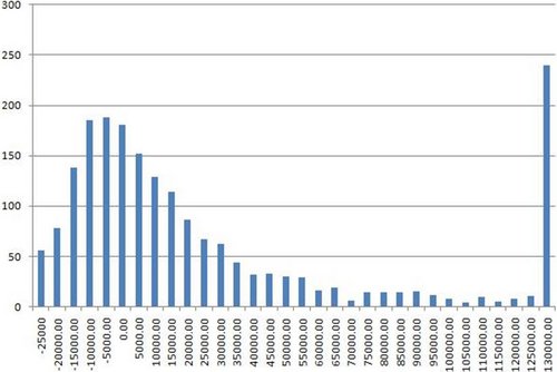
For now, let’s see what happens when you raise the ROI. Let’s take the same batches of ten WSOP events, only with an ROI of 100%. A player in this bracket figures to be a good – perhaps not well known – live tournament player, but a very solid one nonetheless:
OK, it’s better, but it’s still not great. First, you’ll notice that the curve is flatter. The player is now getting relatively more biggish wins (say in the $50,000 to $100,000 range) and the mode (the most frequently occurring result) has moved up the graph a bit. The bad news is that the mode is still negative: the most likely result for the player is that they will come back from Vegas between $15,000 to $10,000 down, and they will come back in the red about half the time.
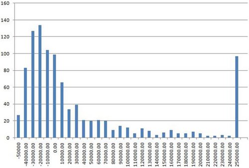
Just for completeness, let’s see the graph of a really top pro. Although there aren’t any concrete stats out there for this kind of player (in general, the sample sizes simply aren’t big enough), the figure most often bandied about is around 200% ROI. A named pro such as Neil Channing or Julian Thew figures to have a long run ROI in this region. (And, so it is mooted, the uber-pros such as Phil Ivey and Daniel Negreanu have ROIs of 300 to 400%, but who knows?)

So the good news is we’ve now got a pronounced curve with the peak well away from the worst outcome of -$25,000. The bad news is that the mode is still negative. Even a top named pro with an ROI of 200% figures to come away from entering ten WSOP events with a 1000-strong field with a negative score 25% of the time, and they figure to end up more than $10,000 down more than one time in eight! Granted, things are looking a lot better than for those with a lesser ROI. The player figures to score more than $40,000 around a quarter of the time and more than $100,000 almost 15% of the time. How often does he come back more than a quarter million up? Just shy of 7% of the time.
A few readers might be complaining by now that top pros play more than ten events at the WSOP. This is indeed true, though I would question how many of them play more than 20 events. Nevertheless, let’s see what the graph shows. Here’s our 100% ROI player entering 20 events at each WSOP (note there are now 1000 batches per simulation):

Doubling the number of tournaments seems to have a noticeable effect. Remember, this is the same player as the second graph we studied, so the expectation remains exactly the same – they figure to make a profit of one buy-in per tournament they enter on average. The effect of playing more tournaments is actually to squash the distribution somewhat (mathmos will observe that it actually makes the distribution closer to the normal distribution). If anything, this graph looks more akin to the graph of the 200% ROI player who had entered 10 tournaments. Once again, by far the most likely occurrence is that the player will end up down, but the long tail is fatter and the chance of disaster is significantly reduced.
Just for kicks, let’s have a look at the graph of a 100% ROI player who plays 40 events. The only thing we know about this player is that he will turn up in full Roman garb, make a twat of himself, and then complain a lot:
OK, now we’re getting somewhere. Firstly, this is the first graph where the frequency of our long tail is significantly bigger than those in the lower intervals (in the language of Chris Anderson: the long tail is getting fatter). Even though I’ve cut off the graph at $300k, the bar which represents all results higher than $300k contains almost 15% of the whole sample. The distribution is, although skewed heavily into a long tail, fairly normalised, with a gentle up curve from the worst result to a peak somewhere around -$30,000. Even playing 40 events, this player figures to come back from the WSOP in the red about a third of the time, but you can see that the distribution of profitable results is reasonably healthy now.
All of the above should go some way to answering the question about what you should expect out of a trip to Las Vegas in a bid to get yourself on the map through WSOP glory. Sure, a lot of fuss is made about the times when someone comes back with a six-figure scoop, but how likely is that to happen? The above goes some way to answering that question. I must say the result of the first simulation I ran gave me a bit of a chill. I ran 2,000 batches of ten tournaments for the 50% ROI player, and the results of the first eight years looked like this:
1.-25,000
2.-19,220
3.-7,734
4.-25,000
5.-13,114
6.-25,000
7.-20,071
8.-25,000
The hapless player finally had a profitable WSOP trip in their ninth year. Want to know how much they made? A mere $10,584! This is a moneymaking player remember!
Lastly, I just want to show what the long tail looks like in all its glory. I left this until last because I think it most succinctly represents what’s wrong with the human mind when it comes to approximating small relative frequencies, and by extension, why lotteries always seem so attractive. In short, we overestimate the chances of low-probability events happening (that why companies selling insurance make money).
I’m sure when most players lie there in bed, the night before flying to Vegas for the World Series, they’re thinking about that bracelet and wondering what their chances are. Well, for a player with a 150% ROI (which is a very good ROI), playing 20 events each year, these are the chances:
This simulation is of 1,000 trips. Once again, the mode is negative (remember, given our player has an ROI of 150%, the mean is, of course, positive). You’ll notice that there are a few local maxima – one around $500k and one around $300k. These correspond to the first and second prizes, i.e. in some cases our player was lucky enough to win or come second in one of the events. Note, however, that it really wasn’t very many cases. There is another spike at the rightmost end – this is a mini-long tail, which contains all the results of $650k and over.
Take a while to look at the graph and drink it in. That’s your tournament career, that is.
I’m sure you get the picture by now. Suffice to say that even with an ROI to make most tournament circuit pros envious, and playing enough events to make even those with loose bankroll requirements raise their eyebrows, the relative frequencies show that, in many cases, the unsung heroes of the felt go home slightly worse off than they started. Granted, the long tail is very, very long, but it isn’t particularly fat.